Latest Post

I have a love affair with wood, but I don't like the golden wood tones that come along with wood that is clear coated or lightly stained. Do I have lots of golden  wood tones in my home? 


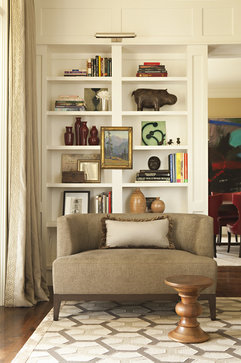
 Yes, history looks after that because my home was built in the 80's when oak was the standard for hardwood floors and furniture. When all your furniture is handmade with love, it's difficult to get rid of it, so I accept my golden tones as period pieces.


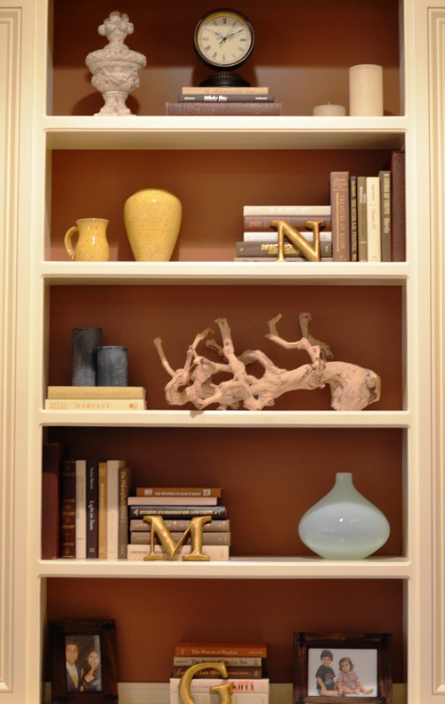
As I've renovated  the upstairs portion of my home, I moved to natural maple flooring  which is about as warm as I can stand. This beautiful cardboard/ brown paper bag colour is very popular right now, and it is a warm tone that isn't too overwhelming.   The great hardware makes this chest look distinctive and sophisticated, but it's not mine!

 When I designed my summer home, my mantra was think driftwood.  Everything there is new, but looks bleached and old!

 There are alternatives for people like me - naturally weathered wood, bleached wood, wood that has whitewashes or gray washes. These tones seem to go so much better with today's modern interiors.  Let's explore the options....


When you make your own furniture you have more options to get the look you want. This new bed made from oak doesn't have a hint of yellow or orange in sight.  I controlled the warm tones by using a  greenish grayish wash before the final semi gloss clear coat.  The  old mid century modern dresser was stripped and treated in the same way,  but I rubbed more of the wash off  so the two pieces didn't look like a perfect match -  I like harmony  with  variety.

This is another example of a washed gray finish that allows the wood grain and imperfections in the wood  to shine through. While it is more traditional in design, the overall look of  this piece  would allow you to use it in most rooms. Give chests like this a chance in your  bedroom, bathroom,  hallway, foyer or living room .

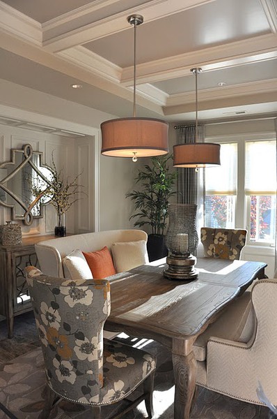
 This traditionally designed sideboard  made from mango wood  could be used in any room decor.  Mango wood is a hard, dense wood that has been seasoned and kiln dried. If left unfinished it has  hues of green brown and yellow which can be interesting .   Because mango  is quick growing,  hard and harvested after the tree has stopped giving fruit, it is  considered the wood of the future.


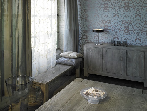
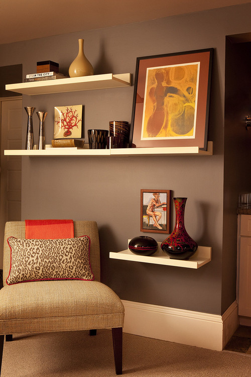
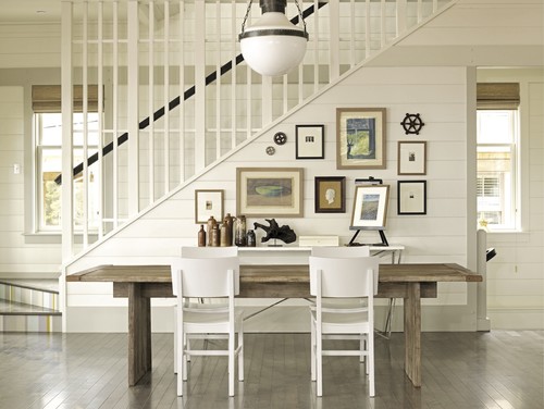
 I'm in love with the cool tones in this room, buy I would like to see a little more variety in the various wood tones used.  The bench could easily be removed and then the sideboard which is beautiful, could shine.

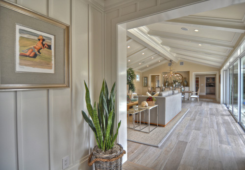
 Everything here is light and airy. The floors seem to go on forever.   It is truly  a room that would let you breathe. If I built a new home this would be my floor choice.

White always looks so fresh when paired with bleached or toned wood.  You have to be careful when you choose lighter woods because they are easily overwhelmed by stronger colours. 
How do you feel about bleached, washed or otherwise light woods?

The devil is in the details and simple decisions can lead to big impact both good and bad.  Since there aren't any  absolutes in decorating, things often  come down to personal preferences.  One of the the things I'm fussy about is what colour rods to use to hang drapes.


There's lots to choose from.

Metal hardware is available in a variety of finishes : wrought iron,  aluminum, chrome, brass, and oil rubbed bronze. Wood hardware is available in almost any finish, from natural blond to dark espresso.
types of drapery rods
Styles of drapery hardware
 There's two ways you can go when choosing a colour for your rod. Choose a color that matches:
  •  other items in the room
  •   the colour of the drapery   
  When you choose to match  other items in the room it is often a good idea, but it doesn't always work as you can see in the photos below.

black drapery rods bedroom

It is obvious that the rod colour decision was based on matching to the dark woods in the room, but why would you want to break the lofty look that is going on here with horizontal dark lines?  When I look at this room, my eye automatically goes to the ceiling.  Contrast always draws the eye.  You probably don't want a focal point near the ceiling! 

black drapery rods printed drapes living room

This rod is also dark, but the same thing isn't happening because the drapes are highly coloured and patterned.  I still would not use black.  In fact I probably would rarely use black because it is too harsh unless you have black drapes or it is a very modern decor. In this room I would look for something lighter that blended with the wooden blind too and make the whole thing more of a unit.

This is a good neutral colour when you have golden tones in a room. 

You also have to watch where you use wooden blinds. The combination below really works.   

bamboo roll up bamboo drapery rod  

 This is a very cohesive look.  When you add wood blinds you automatically introduce a more casual element to the space and usually the colour is lighter. Choose your rod accordingly.

back pleated drapes light gold rod

 This rod has enough colour to be noticed and it allows the drapes to have center stage. Imagine what a different room it would be if the rod  were black.

black drapery rod with banded drapes

How do you feel about this rod choice with these drapes?  Certainly  the black isn't as harsh as in some of the other examples, but it does compete a little too much with the horizontal banding for my taste. Personally I would choose something more neutral  to  match the top of the drapes.


light drapery rod cohesive look

A pulled together look. 


What are your thoughts on choosing an appropriate drapery rod for your space. Do  you have an aversion to black rods in light spaces?

Some colour schemes are a dime a dozen and others are just daring and interesting. Today I'm looking at salmon/coral/melon and pink/rose/magenta.

Now I'm not saying I would use these colours in my own home. You can appreciate from afar without committing!  These rooms have just too much colour for my personal style.  I'm attracted to them because they are so vibrant and fresh.  Isn't it a good thing we don't all like the same colours?

 How do you feel about these rooms?  If you could transport any of them into your own home would you?

This colour scheme seems to be most popular in bedrooms. 

 Interior Designer Artistic Designs for Living, Tineke Triggs

The white bedding  and accessories work well to balance the hot colours.  White has many uses in decor and acting as a backdrop is just one of them.


You can't deny that these colours are great for a kid's room.  I'm really liking the hit of lime green as an accent.


This is the subtle version of this scheme.  Just a hint of melon with a deeper pink. Both are tempered with lots of off white.  That seems to be a common thread through most of these rooms.

More vibrant colours against light walls and furniture. The pink is leaning toward purple and there isn't that much of it. 

 This room turns it around and focuses on a rich magenta with smaller pops of orange. Do you think the headboard is dramatic enough or would you like to see a big piece of art over it?


Do you fancy one of these?

Living rooms


 Lots of white to play with these two vibrant colours. I'm longing for a little more pattern, perhaps a stripe with a third colour thrown in to replace the pink cushions. 

Here are some choice....


I would go for the purple one. How about you?
 
 While we're at it what let's think about the white vase... Hummm...

Choose one.  No matter what pillows you choose there's a vase that works.

  Can a room be over matched?  YES!


Deeper pink leaning toward red with just hints of orange give a totally different look.  In this room a neutral tan  in varying values serves as a backdrop to the vibrant colour. I like the fact that this room is not too over matched.  Lots of pattern in the pillows.


Simplified Bee®: Sweet, Modern Pink & Orange Nursery Room for Baby...


Dining rooms have a tendency to be formal affairs with matching table and chairs. but that doesn't mean they have to be. You can shake it up with unique styles and colours.    Here are some of my favourite Wow dining "sets" from my Pinterest collection. 

Make it  patterned


These luxurious chairs invite you to cozy up to the table. I'm a sucker for texture, and I would totally enjoy having a meal at this table.  Think of how soft the fabric would be!   I like the fact that the chairs  are patterned on the back and  plain on the opposite side.  The tufting supports the more traditional design and the high back chairs at the ends work well with the size of the space and the curves of the other chairs. The  hobbled roman shade is is a soft but clean window treatment in this room.  Lots of ideas to steal in this set up.

Repeated curves

 Lately I'm very attracted to everything aqua. Doesn't this colour look great with dark wood?  Curves abound in this room - in the draperies, the stairs, the chair arms, the vines in the carpet and in the light fixture. A soothing room all around with an unconventional chair colour.

 Popping yellow


Who could ignore these canary yellow chairs? I love the way everything else in the room plays second fiddle to the chairs and allows them to be the star. I want to whisk those red flowers away though. Don't we all have our opinions about what looks best.

Serene colour scheme


This room is different in every way from the one above. I love the clean lines of the benches and chairs . Remember that you need a central leg or an X leg if you want to move easily to and from a bench style seat. Armless banquettes are the most versatile.   The texture on the front of the buffet;  the circular ceramic vases with  twigs, and the rounded edges of the table add interesting lines and some complexity to the room. The colour and lines of the light fixture work well with everything else.  Doesn't this room look serene?

 Repetition of curves


More  banquettes, but this time paired with patterned chairs and a curvy table. The four leg table design will make getting into the banquette a little more difficult.The arms will add to the problem.    The chair  shape is repeated in the  mirror and the doors of the buffet.   An interesting mix.


There's nothing formal about this room! It will definitely appeal to the colour and texture lovers out there. I want to see a more substantial table with all this colour, but that's just me.

How do you feel about chairs and tables not matching?

 Are your selves like mine?  They start out beautifully arranged and over time bits and pieces of things end up store there, and soon you have a  messy jumble.  If you are someone who can relax in a space no matter what is going on in it, perhaps a jumble of objects  doesn't bother you.  I'm not like that.  If my environment is in a mess that is how my head feels. 

Here are 5 great tips to  bring order to unruly  shelves.


Vary sizes of objects 


One of the simplest rules when arranging vignettes is to have a range of object sizes for variety.  Some should be small , some medium and at least one piece that is large. And remember to layer to create interest.  Put a tray at the back and then stack  books and a small object on top of them. If you layer artwork make sure it is actually visible.  There's nothing more annoying than using art work in a display and then covering it up.

Use repetition

Hillgrove Project traditional living room

Bookcase Accessorizing eclectic living room 

Repetition, when used well, creates a strong design. Choose several elements to repeat throughout the bookcase/shelving. If you have one stack of books laid horizontally, repeat this arrangement in at least two other places.  Use small sculptures, boxes or vases and rest them on top of a pile of books or magazines.

Keep it neutral 

 shelf-style-overall.jpg

When you have a range of objects to store,  one of the best ways to keep things looking pulled together is to choose neutral colour schemes.  I love white objects for this purpose. You might also consider silver, brass, wood etc.   There's a lot going on in the space above, but because everything is white or very pale, a cohesive look is achieved.


 This neutral scheme allows the homeowner to display stored items in an interesting way.  Also notice that the organization on each shelf is organized in two sets with both having equal visual weight.


This is as neutral as you can get in both theme and colour scheme.I love the repetition of bottles and books with variety achieved through shape.

Keep interesting elements at eye level


This is an easy one and it really makes a difference. When you walk into a room , you tend to see what is at eye level first.  Don't forget about "seated" eye level  too.  Keep boring objects toward the bottom.  Also remember that if you have a line of books or really dark objects they will have a lot of visual weight and should rest at the bottom of the display.

Create relationships

 Living eclectic living room
 
Choose a common element when you arrange shelving.  It could be similar colours, shapes or content/theme. Choose objects that relate to one another in colour and/or shape to create unity. Vary the size of objects and make sure they relate to each other in some way. In the images above the common theme is containers interspersed with art work.

San Fransisco based designer Jiun Ho creates rooms that are harmonious and balanced by using textures against clean lines, simple fabrics and inviting shapes. I am attracted to his interior spaces because they re so well thought out and the scale of everything always seems right. Symmetry and restraint play a prominent role in all his work.  If I had to describe his interiors I would say they are tranquil,  classic and timeless, three characteristics that make beautiful interiors.   He describes his work as   " ... all about style rather than fashion, all about relaxed living rather than studied formality." 
 
 The quite simplicity of this entrance is perfect.  Some might consider it too stark, but I always find clean lines and minimalism  invite one to relax.

This small kitchen space uses an island to increase storage and provide an eating area. Although the cabinets are a darker colour, the lighter walls, floor and  seats balance the darks nicely. 

There is an overall lack of "objects" here,  but those that are chosen have perfect scale for the room.


In his palettes  you usually find one colour as an accent  used with darker neutrals - in this case  brown red . In the rooms below it's a rich gold.


 These two rooms share the fireplace and you can peek through from one to the other.  Perfection. Again darks are broken up with a significant amount of light and the lighting is provided by clean lined fixtures with bold scale.


How do you feel about these rooms?   Do you have a favourite?

Author Name

Contact Form

Name

Email *

Message *

Powered by Blogger.