Articles by "decor trends"

Showing posts with label decor trends. Show all posts


Are you someone  who loves pretty, sparkly, elegant, or glamorous in home decor?


 Do you love to continually redecorate, change with the seasons etc. Are you someone who loves accessories?  Many people have this "refined" up to date, concept of beauty and want their living spaces to reflect that.

Believe it or not, there are also people who are equally determined not to have spaces that are perfect and new. They like more pared down, earthy, calm environments that have "real" objects in them.  Some refer to this look as zen.


As in all things there is usually a middle road that people like to take.  I am certainly not, nor never have been, attracted to glamorous spaces, with silk, sparkle and too much excess.  Comfortable, calm and clean lined is more my vibe.


I have always found the Japanese world view/aesthetic of wabi sabi that acknowledges three simple realities: nothing lasts, nothing is finished, and nothing is perfect, very freeing. Such beliefs allow you to accept the dents, scratches, wrinkles, splits, cracks and scuffs as part of the history of a piece that makes it unique and authentic.  If you want to know more about wabi sabi check out this post.


Natural materials predominate in wabi sabi homes: paper, aged wood, linens, cottons, etc. Look for anything that celebrates the  marks of time, weather, and  the effects of loving use. In other words look for objects with history on their surfaces.

 I am definitely attracted to the tenets  of wabi sabi, and if you went around my home you would see subtle evidence of my interest in the marks of time, wood, and natural materials like cotton and linen.
But you would also see pristine, light, glass  and leather.  For me combining new and old  is also a statement that  probably brings more attention to the less than perfect objects and what they mean.

I find spaces that have obviously combined the up to date with the old and authentic very interesting, and I think about them as approaching wabi sabi rather than fully embracing it.


An old door made new with yellow


A less than perfect stool in a white bathroom


Pristine white sofas paired with antique, simple tables and a wooden bowl.

An updated but old space with remnants of the world outside displayed.  


Modern art paired with a rustic bench and less than perfect but evocative pottery. 

Isn't  great interest created when you set up comparisons in your space?  

Have you ever looked for similarities in rooms you are attracted to in magazines or online?
That's one of the best ways to determine what you like for your own decor.  If you don't know where to start here are several suggestions to set you on your way to finding your personal decor look.

Develop a vocabulary for your style 


Initially you may not have the words to describe  why you are attracted to a space or why you find it interesting, but you will over time if you do enough looking and comparing.


  1. Start with some rooms you  don't like at all. 


When you have about 10 or so look at them and decide what you don't want in a space.  This is just as important as what you do want.

Here's a room that doesn't  particularly ring my chimes because it has too much glitz and materialism.  It reminds me of  a woman who has on too much makeup and bling,  but there are lots of people who love a glam look.  I'm not judging, just saying it's not for me.


glamorous living room

 2. Have a category for rooms that you like aspects of


     It might be the furniture or the fabrics or layout.  It could be how it is accessorized. It could have one thing you like or a number of things.  Identify what you like and don't like.

interesting vignette, creative vignette, Caleb Anderson
Caleb Anderson 

You can be attracted to a space and not like all the components of it. I appreciate that this space is dramatic and artfully conceived.  Dark wall colours are not part of my aesthetic nor is traditional decor, but I find myself drawn to this space. Why?


  • mix of  some traditional and modern (furniture and art)
  • accessories in vignette combine colour, texture, form and  different styles
  • the perfect intersection of chair back with art  making the chair an integral part of the vignette
  • there is nothing cookie cutter about this space; it's totally individual /unique
  • the variety in the vignette arrangement takes my eye back again and again
  • it is the opposite of what I like usually (light interiors, clean lines and more minimal look) 

3. And most importantly find rooms you love


 Here are some spaces I love from recent pins on Pinterest.

Room #1

geometric white and black tile, modern kitchen, flat panel kitchen doors


 This room couldn't be more different than the one above!  It is a space that I think is timeless even with the bold tile choice.

Here's what I like about it:
  • simple geometric patterning in neutrals 
  • simple lines in flat panel doors
  • mix of open shelves with doors to provide some visual relief
  • mix of wood,  white and geometric to add interest 
  • this would be in style for years

Room #2 

black and white patterned pillows, Scandinavian living room,

There are similarities to the kitchen above if you really look. Here's why I find this appealing:

  • mix of warm wood and neutrals
  • a room has to have at 3-5 different patterns for me to find it interesting
  •  a touch of the outside is important to me (plants and wood) 
  • lots of textures
  • pared down but inviting because of the rug and the pillows

Room #3

black and white bathroom, black mosaic tile, wood in bathroom,
Such a great space:

  • white, black and wood
  • it looks like a well composed abstract painting
  • very geometric in layout, especially the vertical window and cube lights
  • the mirror connected everything visually 
  • like how the sink is like a piece of furniture, not hidden
  • this is a unique space

 Establish a my style and not my style boards on Pinterest 


I find it useful to have one board on Pinterest that focuses on my style. I am selective in what I put in there and often go back and delete things until I am left with what I find pleasing. If you don't want to have it open for all to see, set up a secret board and record negatives and positives without insulting anyone!


Find your look/style by doing quizzes online 


This is a short quiz and was spot on for my style when I completed it.  You have to provide your email address to get your answer. 

There's a range here from Houzz to Lonny and  Better Homes and Gardens. 


I hope these simple suggestions will help you define your decorating style.  We are all unique and that's what you should aim for in your home.   Go for it!

 Yes, I've been Pinteresting too much again. It's one of the best ways to see what the common trends are in interior design.  I am not talking about the "cutting edge" ones touted as design trends for a particular year, but the ones that you know average people usein their homes.  These common elements are sometimes referred to as "decorating crutches" because anyone can use them in any space.   I bet you know them already because they are constantly flying by your eyes on Pinterest or Instagram or in home decor stores.

 Check out some of the hallmarks of decor predictability in 2016  compiled from an evening of online viewing. Here are a few pics for you.   Can you see any similarities in these spaces ?


Here's what I came up with...
  • overly coordinated fabrics and accessories 
  • trays used to corral vignettes on tables
  • stacking books in vignettes 
  • pale rugs 
  • lots of  candles 
  • box store art
  • art that gives you directions (word art)
  • antlers and faux taxidermy 
  • empty frames ( is it a conceptual art statement or just a thing?)
  • dishes that match a room's colour scheme
  • accessories covering every flat surface
  • cute holiday and seasonal vignettes
  • beachy colour schemes 
  • hurricane lanterns
  • girlie chandeliers 
  •  mirrors everywhere  
  • mason jars used for every conceivable purpose
  • fake topiary
  • changing  seasonal/holiday displays 
  • gallery walls with everything apart from real art 
  • large wall clocks 
  • bleached wicker 
  • overuse of baskets for storage
  • and abundance of pillows and throws
  • gray everything
  • pale wall colours
  • family references and a touches of sentiment
How predictable is your decor in 2016?

 Is it a bad thing to be predictable?

  Probably not.

 We like what we like, and likes are developed through exposure (repeated viewing). In today's world of social media we do a lot of viewing.  Likes are also shaped by your social circles, your decorating budget, and what is  readily available in a local area.  Sometimes we want to be the same as our friends and we model each other.

We all have things we are attracted to and use in different ways in our homes. From the list of overly used elements above  I  am guilty of: stacking books as fillers and to vary heights,  using trays to corral objects in vignettes,  layering with  throws and using an antler in various arrangements (but it's a real one found on a hike) and I do have a thing about pillows.  I am happiest in light rooms and gray has been my go to neutral since 1985.  How about you?

Stay tuned for 10 ways to interject a little decor rebellion in your space.


 The Oscars are always a spectacle, sometimes inviting, sometimes confusing  or repellant depending on your life view.   I have my issues with them, but that's not what this post is about.

In addition to rooting for my favourite actors and movies, Oscar night is a great opportunity to see how fashion trends (always connected to decorating trends) play out on the red carpet.  The best and worst dressed are a matter of opinion.  This is obvious when you read several sites and compare the observations with your own.

Blush pink and its variants was the stand out colour for me.  Even some of the gowns described as white had subtle pink undertones. 

Blush Pink appeared in late 2014 as a trend in fashion and decor  and is continuing into 2015 especially in the European market.  It is a delicate hue that looks especially good with soft whites and/or pearly grays.


blush pink, decor trend 2015, blush pink furniture, blush pink accessories,


This style board gives a good representation of how the trend plays out in furniture and accessories. 


 And in fashion ...

from the merest hint of blush

 Kerri Washington

 Viola Davis 

Karolina Kurkova

Jennifer Aniston 

 Oprah

Zoe Saldana 

Jennifer Lopez

to its darker depths

Gwyneth Paltrow

and more vibrant applications. 

The pinks have it.  

Could you live with a little pink in your life?


Mantles can bring out your inner decorator or cause you frustration.  I hope at the end of this post your inner decorator will be leaping.  If you don't have a mantle, but have a buffet, console table or even a wide window ledge all the principles/design tips  still apply.  for additional information about  decorating above a fireplace check here.

Come along to a traditional home that is getting a foyer facelift.

Fireplaces and mantles are usually a focal point in a space.  Often there are other architectural details that ensure it is a dominant feature.  In this case, there are two archways on either side of  the fireplace, one into  the living room and the other into the dining room.  While the fixtures in the home are traditional, the homeowners have mixed in contemporary furniture while still honouring the original feel of the house.


Original photo from homeowner
Initial observations:

The mirror:
  • reflects the chandelier adding interest 
  • has simple traditional styling  that relates well to the  the other architectural features
  • will  reflect what is put in front of it adding  visual depth
  • frame has same tones as floor only darker
  • fits the width of mantle, but seems to overpower it (less so when you are in the space)
  • is heavy and mounted on original plaster walls, it stays 

Thanks to the program Olioboard, I can import the original photo from the homeowner and layer options on top of it. That's designer's dream when presenting ideas to a client.

With the central position of  the fireplace between two archways, a symmetrical design would  be a fitting line of design. l

Solution One:

 Emphasize a vertical layout using art to bring the eye up.


Including art work with a white matt  connects with the mantle colour (try to match the white matt with mantle, yes, this one is a tad too bright). You can play with the style of art work.  Sometimes adding a modern piece is a way to combine styles. 


traditional mantle, mantle vignette, art, decorating a mantle

traditional mantle, mantle vignette, art, decorating a mantle

traditional mantle, mantle vignette, art, decorating a mantle

Thoughts:
I like the simple calla better  because  the lines are vertical and the simplicity of composition and colour scheme is calming and works better with whatever objects you choose to put beside it.  I like rounded shapes next to verticals or if not rounded, something with soft, irregular  edges.  My choice would be the vases  rather than the topiaries because I like a lighter, softer look.

traditional mantle, mantle vignette, art, decorating a mantle


Here's the same idea with a more traditional painting without any white.  The look is dark and a little overpowering and with no overlapping it looks a tad to boring.  All of this can be adjusted of course.  Which  painting works best? 


Solution Two 

Bring your eye in from the sides of the mirror by creating two strong verticals. 

traditional mantle, mantle vignette, flowers, decorating a mantle, sculpture

This is the opposite of the first solution but you are still using verticals to direct the  eye up. Having the flowers in a dark/clear frame connects with the darks in the fireplace, and also with the white in the mantle.  The vases are contemporary as is the sculptural piece but they all "play nicely together".


Solution Three 

Go neutral contemporary and layer symmetrically.

traditional mantle, mantle vignette, decorating a mantle, vases,

This arrangement still brings your eye in from the sides of the mirror and emphasizes the vertical, but it is an overall softer look.


Solution 4

Pick up the  colours in the fireplace and layer symmetrically with a mix of traditional and contemporary.

Solution 5

Use battery operated console lamps and soften  the arrangement in the centre.

traditional mantle, mantle vignette,  decorating a mantle, asymmetrical design


Just for fun...

the girls in the house would pick this one!


and I am  more comfortable with asymmetrical designs.


There are so many options  and each has its own reasoning.  In the end it all boils down to personal taste. Which would you choose if you were the homeowner? 

 We are hunkered down for a winter storm with 40 cm. of snow predicted.  Everything is closed so there are no schedules to keep. It's the kind of day where I have lots of time to let my mind wander where it may.  That's a dangerous thing when you can go from one thought to a hundred in a minute.  So let's see how I got from snow to this post.

White, cold, wishing for spring,  Easter, eggs, decorating eggs, symbolism of eggs, egg imagery through history, eggs in art, design trend for 2015 (read it on Houzz this week),  Las Vegas Market trends Winter 2015, should write a new blog post because I have time today, anyone else predicting eggs are hot, search Pinterest.  Yep!  That's how my head works.


What is a trend?


Decor trends  are predictions based on patterns recognized from multiple viewings of similar material.  Anyone can make trend predictions if they have enough information and time to look for patterns.


 Here are some of the patterns I'm seeing on Olioboard, Pinterest and design blogs that indicate that eggs and egg shapes or oval shapes are appearing in textiles, lighting and home accents.


Sometimes  eggs are represented literally and recognizable as what they are.  You will often see nests accompanying the eggs as in the pillow and art works above.  Sometimes the egg shapes are abstracted and used in repetition to create patterns.  These are the ones I find most pleasing.  

egg motifs, eggs decor trend 2015, egg shapes, egg patterns in textiles

Is it just me or do you find anything egg shaped or hinting of it pleasing/soothing to the eye? This characteristic makes it a perfect shape to choose when you want a lighting fixture to just sit there and hold a place without being  too dominant in the decor.  Sometimes this is not what you want!  For excitement do not choose  of the lights above (except the red one).


Jeff Koons, Cracked Egg- Blue

Egg shapes have always been a favourite of artists through the centuries.  Not only is it a pleasing shape, but the symbolism of promise of things to come, fertility, and creation  makes eggs a multifaceted starting point for many artistic explorations.

Paul Lichetenhan - Nest 
This work created by Paul Lichtenhan couldn't be more different than Koon's  reflective, slick and very large cracked egg above.  In this piece the aged patina of the recycled metals stand in striking contrast to the delicate ceramic eggs. 


Andy Goldsworthy 
 Goldsworthy, an environmental artist, makes a different statement with his large, stone egg defying our usual interpretation of this delicate, fragile shape. 

Ron Layport
Finally Ron Layport creates  intricate, egg shaped carvings from wood.  In all of the presented  works the material used to create them is as important as the subject matter.  Each has its own beauty. 

Eggs, simple or complicated, realistic or abstracted, may appear in some form in your decor this year. Perhaps you are ahead of the game!  Have you noticed egg motifs in your online viewing or shopping experiences?


It's that time of year again. People are beginning to think about 2015 and what it will bring. When you're a home decor blogger that always means checking out the hot new trends.

So here goes- my first trend snippet for 2015.

Sometimes even patterns we love can lose favour if they are overused.  Chevron comes to mind.  What was once a fantastic pattern that played well with other patterns because of simple, graphic lines has been overused to the point of -dare I say it- nausea.

Ikat                                     Suzani 


I fear that Ikat (chevron is a staple of this traditional Indonesian design) and  Persian Suzani (with it's bold circular motifs ) are not far behind in the over used category.


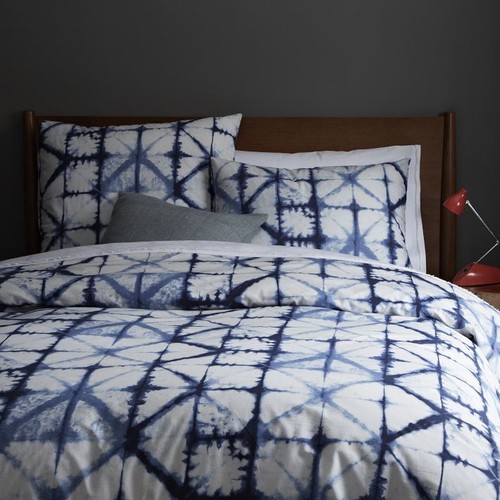
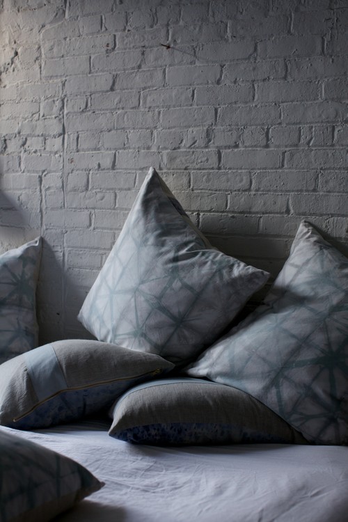
 There is chatter that Shibori (Japanese tie dyeing) is the next new pattern to take over in textiles. I can see the appeal of Shibori.  It is geometric (very hot right now), simple on a white background, has multiple patterns possibilities  depending on how it is produced, and has cultural references.  Then there's that indigo blue which feeds into the resurgence of blues and navy in colour trends.

You many not be familiar with this age old Japanese technique. Shibori patterns are usually created on white silk by binding, clamping and wrapping around poles and then dipping into indigo dyes. If you are hankering for the 60's again, or don't remember them and are ready for a new DIY experince, check out this article 


Red was all over High Point Market this fall and just seeing the little hit of red in the lamp tells you traditional indigo shibori would look great with any amount of red. Certainly whites and other blues would also work and why not yellow?

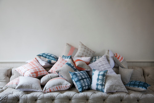
It is definitely a keeper when it comes to pillows.


shibori pillows

This proves that it is possible to have subtle colour ranges using contemporary dyes


shibori pillows

shibori colours
source 

and different colours...


shibori chair

shibori sofa

used in  different ways .

shibori bedding , shibori curtains

I am certainly liking it with very neutral schemes because it is fresh and interesting without too much fuss. 

Only time will tell if shibori will bethe next big thing. Do you think this pattern will have a place in your home?

Author Name

Contact Form

Name

Email *

Message *

Powered by Blogger.