Articles by "art arrangement"

Showing posts with label art arrangement. Show all posts

Summer is officially over.

Did any readers notice  I took an extended holiday away from Designing Home blog?

This is where I spent my summer.


The little speck of a house in the background is my favourite place in the world. The views are spectacular and the ocean in all its moods speaks daily.  Duntara is as close to heaven as you will get.

I had a marvellous summer full of creativity, conversation, relaxation, long walks roaming the beaches, whale watching and iceberg viewing directly in front of the house and on and on it goes.  I'm coming to fall with a renewed focus on my art practice.  It feels very satisfying. 

My new work continues to focus on  what gets left behind, but I have moved from two dimensional works to three dimensional using found wood and objects to explore Compositions in Time.  


wood assemblage, wood collage, found materials,
Composition in Time #22,  2016, Margaret Ryall , wood assemblage, 16 x 16 in. 

wood assemblage, white wood, remnants,
Composition in Time #27, 2016, Margaret Ryall, Wood assemblage, 16x16in.

white and blue wood assemblage, reclaimed wood
Composition in Time #29, 2016, Margaret Ryall,  wood assemblage, 16 x16in. 

For more work check out my website   


Rant warning!

Have you ever noticed how your location impacts design because of availability of products?

I live in a terrific city, St. John's,  on a beautiful island, Newfoundland, in the North Atlantic known for its culture and brightly coloured homes.


 But there is a downside to living on an island; it doesn't always provide ready access to a lot of products especially in interior design.   Judging by the homes for sale on Realtors.ca in my local area,  this is a common problem for more than me or my clients. That being said, every now and then you find the perfect solution to your design quandary at local businesses.  It just shouldn't be a sporadic event.

Yes, I know in this world of technology anything is possible, but if you are super fussy about undertones and/or comfort, it would not be smart to order a big ticket item without setting your eyes on said object.  That leaves custom ordering from fabric samples and hopefully a floor model to test for comfort and waiting 8 to 10 weeks or more. Is my impatience showing?

 What about when you need something in a few weeks or you don't have a grand budget?  Back to roaming the limited selections and hoping something has magically appeared since your last visit.  Sometimes it has!  

I admit trying to find  the simplest things often cause me the most angst.   Now don't get me wrong, I am not looking for odd or far out things. I love more soothing, monochromatic schemes and often describe my own personal style as blah with lots of art and fine craft. Sometimes blah is difficult to achieve! 

 I went to Homesense weekly for six months to find the type of lamp I wanted for my living room.  I was just not willing to spend $200.00 on a lamp.


My lamp and another Homesense gift from a friend

The last month has passed me by as I tried to source a specific wallpaper for my upcoming kitchen reno.  


 I  finally located  sources for  the mosaic wallpaper in the US and England.  Perfect you might think.  So did I, until I found out the $7.00  US  6 x 6 in. sample would cost me $56.00 by the time it was delivered to my door. That didn't include GST or whatever else Canada Post decides to ding you with at the door.  Not going to happen!  Move on to the next idea.


More than colour and next to texture, I love subtle patterns and in tile the Italians know how to do pattern well.  Again I knew what I wanted,  I could even paint a picture of it if requested. That's  more depressing when you can do that,  and I have seriously considered painting my own  tile if all else fails!


Marazzi 


 Online I found the exact thing I wanted  on a tile site in England.  With hope I tried two local tile suppliers who assured me nobody is looking for patterned tile like that.  I am!  I am all about monochromatic patterns.  It's just not in style in this area I was told.  More reason to choose it in my book.   I have visions of me getting the 15 sq. feet  I need in England this fall and making all 7 of my travel companions each carry some home for me. Don't laugh this might happen, if I can't find a Canadian supplier or a comparable tile .  One last place to check out.  Fingers crossed.

And IKEA's  floating shelves are only available onsite.  That's my latest disappointment.

I am worn out before the kitchen reno even begins.

 Do you have similar frustrations where you live?  How do you get around them?


Ideas for using burlap in crafty, country decor have taken over my Pinterest feed lately.  My own decor is a mix of contemporary and mid-century modern with a generous application of contemporary art.  Burlap just doesn't seem to fit with that mix.  But wait...  just tell me something doesn't work, and I am on a journey to prove otherwise.

 Currently in my art practice I am questioning public expectations for certain materials.   Perhaps that's why I am thinking about burlap.   All those country/homey pins for burlap  got me thinking about raising the ante, by taking burlap  out of its country comfort level.

So let's explore the question.


I like burlap because it ...
  • has texture;
  • is a natural fibre from the jute plant;
  • is a renewable product because of its source;
  • is  available in several  neutral colours and can be dyed; 
  • is relatively inexpensive;
  • can be used without sewing;
  • accepts paint well;
  • comes in a variety of widths and qualities;
  • has an open weave for introducing  different materials into design. 


On the other side are several drawbacks...
  • it is smelly; 
  • cheaper varieties are very coarse; 
  • it is usually stiff and doesn't gather well; 
  • the weave is uneven

Here's a collection of commercially produced products using burlap.  Obviously, this isn't the burlap you wrap your trees with in fall!


There are also lots of options for DIYers or to purchase from sites like ETSY. 

Pillows 


source 

Window Treatments 


Runner 


Art 


Now it's your turn....


When does a trend become overused and tired?

Sometimes certain trends are grabbed by many homeowners,  and before you know it they are everywhere and you may begin to feel like you have reached your viewing saturation point.  I get this feeling a lot on Pinterest. It might be a pattern, a wall treatment or specific fabrics.  I find myself thinking... please no more.

Does it really matter to the average homeowner?

Only you can answer that question. I'm not censoring  what a homeowner chooses to use to decorate a home. Rather I am  just commenting that certain  design decisions seem to be very overused, and as a result  if you want to have a home that is a little unique or individual, these design decisions are probably not the way to go.

Chevrons


chevrons, bedding


I have always been a lover of geometric prints.  There was a time when I loved chevron designs, but that affair has ended!  Too bad I have to say good-bye;  perhaps in ten years we will have a reunion.


Animal prints

animal prints

I have to work hard to warm up to animal prints, but  I agree that their  organic spots and stripes are very interesting when you want to include  patterns in a room.  Maybe one or two  animal prints might be good, but more than that becomes overdone.  I like to  introduce them using small items like a  box or a pillow because they are easier to replace when you get tired of them.


Blackboard walls

blackboard wall, kitchen

Having been a teacher, I left blackboard walls behind years ago.   I think they work well in  a child's playroom or bedroom because they serve  a functional purpose, but they are dusty. Think about allergies too.  There is something messy and not quite right about them in main rooms of a  home.


Gallery/salon  walls

gallery wall photos

I love  smaller gallery walls that are very organized.  Too many items and you end up looking at the organization (or lack thereof)  and not the individual  pieces of art.

Baskets everywhere


bathroom shelving, baskets

I have  baskets in my home here and there because they are functional, but I am always careful  not to overdo it.  I don't want someone to walk in and think ... the house of baskets.


 Text as art

text art walls

  Yes, I like quotes, I even collect them and I love text.  Their use as art  just seems to be way overdone in the last few years.


Faux taxidermy


faux taxidermy, white deer heads, vignette

 Here's another design  motif  that when  used in the right setting  added an individual note to a space in the past, but not anymore because faux taxidermy is  everywhere and I am still trying to figure out why.  Are you a lover?


Starbursts


dining room starbursts

Another beautiful motif that has reached the boredom point from overuse.  As a lover of circles and rays I would have to think  long and hard before using a starburst in a design right now.  Too predictable!  Another element on my revisit after 5 years list.


Large horizontal stripes


black and white stripes

When this image first popped up on Pinterest I was attracted to the strong graphic nature of the stripes.   Very quickly bold, equally sized and spaced stripes were popping up everywhere especially black and white ones.  Nothing was sacred as they appeared  on walls, rugs, pillows, tables etc.


And how about you?  Do you have design elements or objects that you think need a rest?  Perhaps you love some of my "tired" choices and want to argue for their continued use.


 The Oscars are always a spectacle, sometimes inviting, sometimes confusing  or repellant depending on your life view.   I have my issues with them, but that's not what this post is about.

In addition to rooting for my favourite actors and movies, Oscar night is a great opportunity to see how fashion trends (always connected to decorating trends) play out on the red carpet.  The best and worst dressed are a matter of opinion.  This is obvious when you read several sites and compare the observations with your own.

Blush pink and its variants was the stand out colour for me.  Even some of the gowns described as white had subtle pink undertones. 

Blush Pink appeared in late 2014 as a trend in fashion and decor  and is continuing into 2015 especially in the European market.  It is a delicate hue that looks especially good with soft whites and/or pearly grays.


blush pink, decor trend 2015, blush pink furniture, blush pink accessories,


This style board gives a good representation of how the trend plays out in furniture and accessories. 


 And in fashion ...

from the merest hint of blush

 Kerri Washington

 Viola Davis 

Karolina Kurkova

Jennifer Aniston 

 Oprah

Zoe Saldana 

Jennifer Lopez

to its darker depths

Gwyneth Paltrow

and more vibrant applications. 

The pinks have it.  

Could you live with a little pink in your life?


You know how it goes with decorating.  You get one thing to a point where you love it and that improvement only makes other things in the space look dismal.  And that is the point where we left off in the last post-  loving the chairs and not liking what is happening on top of the buffet.  

painting upholstery dining chairs  buffet vignette
Almost but not quite

One problem area

Let's start with the lamp.  I've always loved this lamp and when  I recently moved it from the living room it needed a new home. I perched it on several books as a way to increase the height and  connect the dark chair colour to the buffet.

  I left it for several days, but I knew what would happen.  Every time I passed by I had the same thought
 ( that shade is way too white).  Problem arising... what were the chances I would find this type of lamp shade in St. John's?  NIL  What was left?  Paint it or cover it with fabric or paper.  I chose paint knowing if I totally messed  it up I could use fabric or paper to cover it. 

What colour? 

 The lamp had to relate to the drapes without overmatching, I trotted to my studio to see what I had there and chose  BM floral white OC29 left over from painting  frames for an dart show.


Benjamin Moore Floral White OC 29 
This  is a dirty white with the faintest hint of warmth without looking too yellow. Perfect in my book. Some bloggers recommend it as a good white for cabinets if you have white appliances.

How to?

 I watered down the paint by half  and brushed it on with a 2 inch art brush -synthetic soft hair for acrylic paint.  It's a  messy business so have something to catch the drips. If you are careful you only need one coat.   It worked like a charm with no buckling or patchy areas.  You definitely have to water down  the paint or it will look too solid and not be absorbed into the fabric. 

  Some references I consulted said to use a fabric medium with the paint but I didn't.  From my art experience I think you could add acrylic matte medium to replace the fabric medium if you so desired. 

Problem two

Once I used  red as an accent on the buffet and in my living room, my beautiful landscape by Carolyne Honey Harrison started to remind me of a Christmas tree.  The green frame (which hubby made for it) had to be changed. I have a terrible aversion  to "seasonal" colour connections.

What colour?

 First I  painted the frame BM Black panther, a soft black I use for art frames, but it was too harsh for this particular  artwork and space.  All you could see was the frame.  I prefer the art to show and the frame to support it.


Benjamin Moore Black Panther 2125-10


Benjamin Moore Iron Mountain  2134-30


Next try was  BM Iron Mountain left over from painting my Media unit (see here). Worked like a charm.  It brought more dark to that side of the room and played off the chair colour without matching perfectly.   My daughter joked that everything in my house would soon be some form of charcoal.  Possibly!

The reveal 


painting upholstery dining chairs  buffet vignette
Almost but not quite

painted chairs  painted lampshade painted frame
Subtle changes make a difference 

And you might think this room is now complete.   I wish!  More problems and solutions to come.
Is paint a solution in your home decor?  I'd love to hear what you've done with it.  

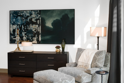
The four corners of a room are often a no man's land when it comes to design.  I am not saying that you have to fill up every corner with something, but I am advocating thinking about your space to determine if  it might need to look more "fulfilled". Here are some of my favourite solutions:

Art 


8 Ways to fill empty corners
Using Art to fill an empty corner
Margaret Ryall

 Usually you can't walk right up to art you place in a corner,  so choose something that can be read from a distance. This lovely matted and framed wood sculpture is stunning for corner purposes.  It brightens up the space, fills it nicely, provides a backdrop for the dark table and lamp base and is a bit of a conversation piece. I was so excited when it was hung on my clients' wall.  


 using art to fill empty corners

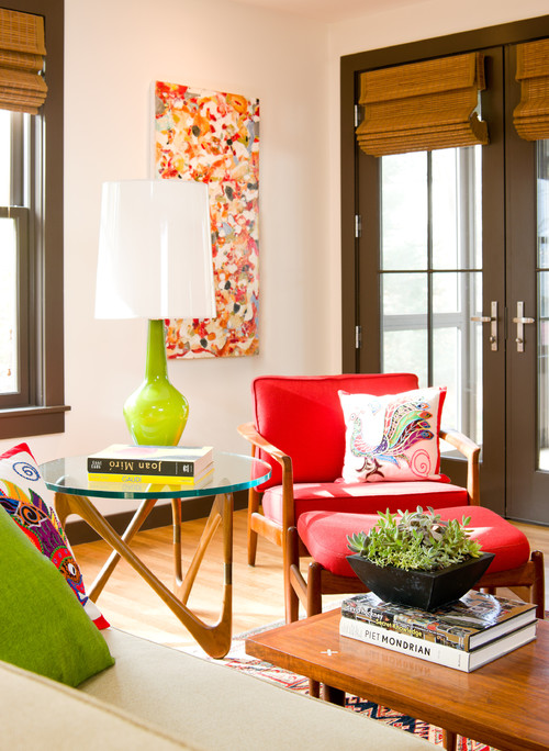
This colourful mid century modern space needs art work to match.   It creates another layer for the space that invites the eye to roam and then return to the equally colourful lamp and chair. 


 Round table and two chairs


two chairs round table  in  corner
Houzz

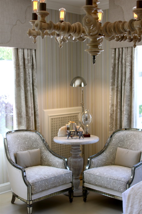
Round tables are great for corners because they allow you to fill the awkward space and at the same time move your eye around so you don't get stuck there visually. The addition of the lamp provides the third height thus creating a more interesting design.

Tall  floral arrangement


round table and ottomans foyer

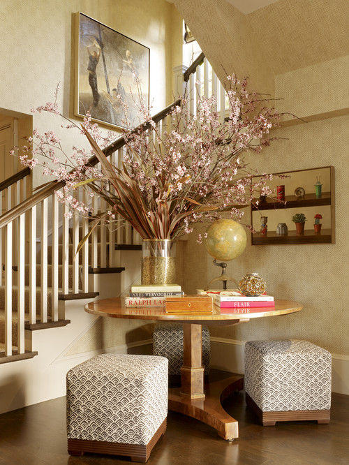
 When you have the height why not go for it and use something tall to fill the space.  Again a round table is the mainstay for  this foyer area. 

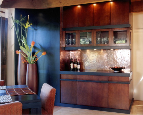
 Built in bookcase 


corner bookcase workspace
Vicente Burin Architects

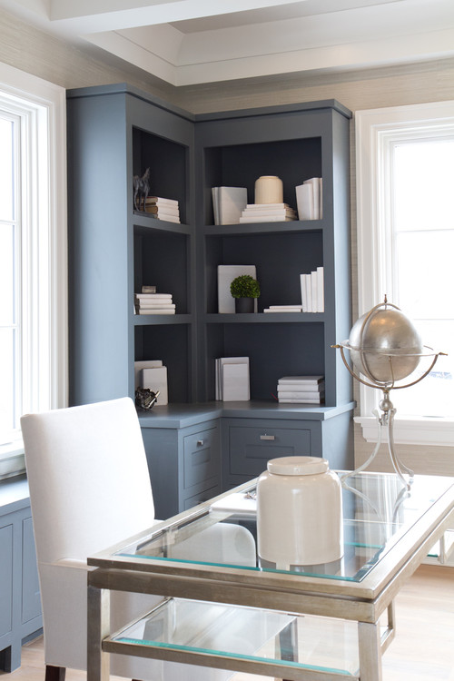
This beautiful set of bookcases  tucks effortlessly into a corner.  The colour adds to the whole space and the minimal arrangement of objects and books ensures it isn't too busy. 

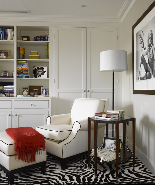
Chair and floor lamp 

 
vignette chair ottoman lamp corner
 Cravotta Interiors

A round floor lamp behind a chair is a perfect and quite functional solution for a corner. 


chair ottoman floor lamp in corner
 Houzz


In larger spaces the addition of a round table helps to fill the corner and provide variety in heights. 

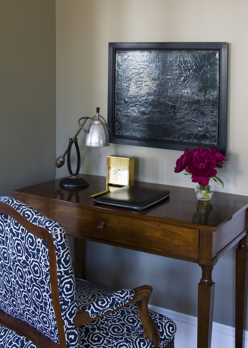
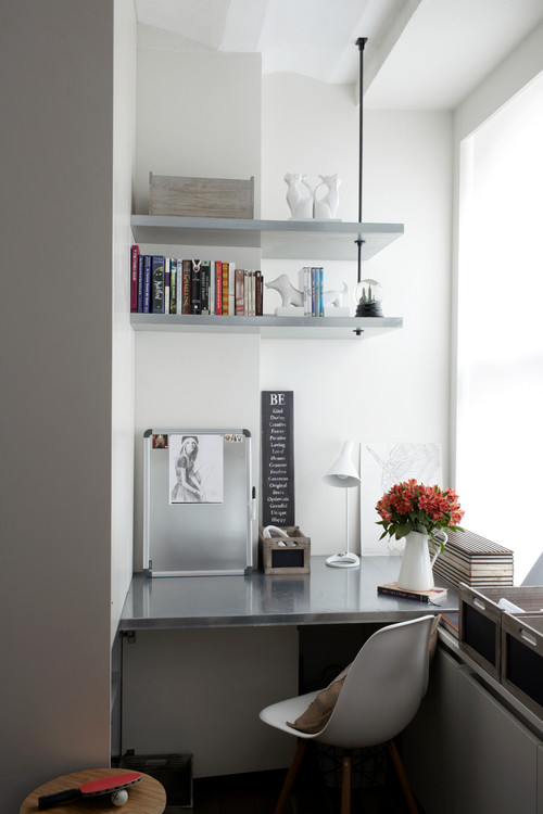
 A  workspace 


desk chair art in small space
Siemasko + Verbridge

Tidy and interesting  art too.


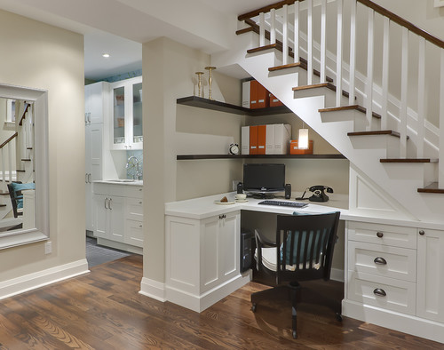
built in office desk under stairs
  Leslie Goodwin Photography

Or perhaps a larger space to make use of a corner under a stairs.  


 built in  workspace desk in corner
SchappacherWhite Architecture D.P.C.

Large scale vases/urns


large urns in dining room
InHouse Design Studio

Sometimes you need a certain something to complete a design and these two large scale floor vases do just that.  Imagine the space without them.  


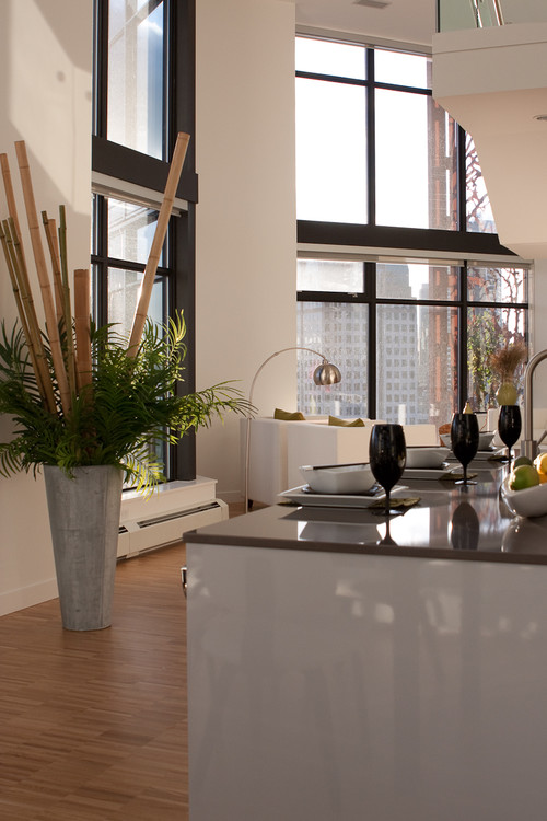
large vase with greenery and sticks kitchen

 This arrangement is not in a corner, but it very well could be.  Rather than bamboo you could use birch sticks if you wanted a more rustic look.

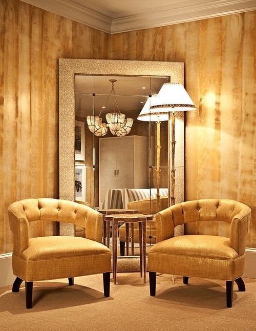
 Corner mirror and two chairs


corner with two chairs table and mirror

Love this solution because it expands the space making it seem like it goes on forever. The glitz and sparkle doesn't hurt either . 

Then there's tall plants, built in benches, screens .... The list is as long as your imagination.  Do you have any bright ideas for filling corners?

Author Name

Contact Form

Name

Email *

Message *

Powered by Blogger.