Latest Post

Fall and Thanksgiving were heralded for the past month on various blogs and Pinterest. How much effort and expense are involved in your seasonal decorations?  My holiday tables always  give a gentle nod to  the season rather than a yell.  Usually I find things to combine from  my garden or my accessory  shelf in my storage room.  It is so much more fun to be thrifty and it stretches you to be creative with less.  In that vein, perhaps these ideas will get you thinking about how  to use what you already have.

 A few twigs from the garden and several small pumpkins in a large vase.  Simple and beautiful.  No pumpkins?  A trip to the Dollar store is in order for fake fall leaves (or the real thing) or spray paint assorted nuts gold and use those to anchor the twigs.

 Scoop  out a pumpkin just deep enough to place a candle in it and decorate the edges with faux leaves, twigs and berries.

 Collect all t he large clear vases you have, place a white pillar candle in each and decorate with nuts or leaves. Change to red berries for christmas. 

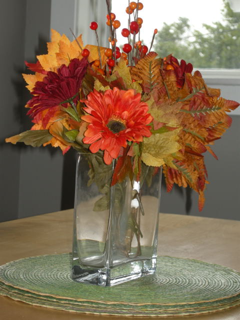
 Use the flowers of the season and bottles to rest one bloom in each .  Line them up along the table.

 Sunflowers, an old brass pan, berries and a green pumpkin.  While real sunflowers are beautiful you can substitute with fake ones. 
 Small vases with nuts, water and a flower on the top.  What else could you use to replace nuts?  A plaid tablecloth is always so cozy.

 Love this idea of stringing small pumpkins/gourds along the table with ribbon and a garland of berries.

 Use small potted plants, wrap them in a vivid croton leaf and place in square vases. Keep it until Christmas.


 I love kale but I've never thought of cutting it and using it inside as a bouquet.  Don't you love the purple ones?


I've been admiring these long wooden boxes for dining tables.  Each season what you put in them changes.  They would look just as inviting along a mantle.  Christmas idea for sure... any bits of wood in your basement?

Which is your favourite?

  All links to these photos can be found on my Pinterest  board.  

Every morning I wake to Benjamin Moore's AF 45 Collector's Item. I like it so much and it is so versatile that I plan to paint my guest room the same colour!  Of course, I will have different accents and the room will look different because of those choices. It is a beautiful colour to hang art work on, and if you are fair it makes your skin look beautiful! Not a bad thing when you have to look in the mirror every  morning. I can't think on an accent colour that would look terrible with  Collector's Item.  I choose a soft green with a secondary accent of grayed purple. There's a mix of silver and gold in the accessories and there's even a little pink and soft blue floating around.
 
 My mid centrury love is showing in all the furniture. I'm getting ready to upholster the  chair which has to just sit there because the space is so limited.  On the left is the ensuite door. .  This  geometric fabric left over from another job is my current like, but that could change next week.  I know I want something with a little pattern.

 I can't seem to re-gift my Tiffany lamp even thought it is slightly off in the room. Sentiment wins with me every time. I guess you've already figured out I don't have matching furniture.   It's the artist in me.  I love to take assorted items and make them work.

 The official description of Collector's Item  on the B Moore website as a "soft off-white hue with pink undertones" that "quietly supports a space like a pedestal supports a sculpture" is spot on.  Don't be thrown by the pink undertones in the description.  I like it because it doesn't have any  hints of yellow which is not complimentary for  someone with silver hair  and fair skin.   If you want to look good in the morning this is a the wall colour for you.

 I've  also seen  Collector's Item  used as a trim colour  with darker neutrals such as Ashley Gray or Taos Taupe (2111-40) as seen on the Benjamin Moore Site. 

Vivid greens are subtly moving into golds and oranges and there's a bite in the air even on sunny days.  My mind is  moving on to what I want to do to herald the  fall season.   I never go all out in these things because my design aesthetic is very understated. The only vibrant things in my home are paintings which for some reason seem to have a lot of orange!  I guess I'm honouring fall year round.

I was at the dollar store the other day and saw some great deals on fall foliage.  Usually that means pulling bouquets  apart and rearranging them so they don't look like they came from the dollar store.  Follow the arrangement as I move it around my kitchen and dining room to see where it looks best.

 Would you like to see something taller and a little larger here? I feel there is just too much space between the light fixture and the arrangement.  The black chairs are very dark and they demand something larger in scale . Better start looking for more deals and find tall, dark elements and another vase.


This arrangement I keep in my dining room illustrates  what a difference height makes even without the bold colours of fall.


When you crop the picture  the arrangement looks bold and eye catching.

With or without the straw placemats ? Your choice. With the placemats it  is homey, without is more styled and contemporary.

  When you pair the arrangement with our giant red mug it seems smaller and less eye catching.

 The bouquet just can't fight the scale and vibrancy of this painting; therefore, it looks totally insignificant. You need something  taller.  

Enter our trusty arrangement for the sake of comparison. This arrangement works so much better because of its lack of colour and height. There's no way you can compete with the colours in the artwork so don't go there. 

 Nestled on my window ledge the bouquet  looks comfortable, but I've created another problem.  The little art work next to the bottle looks lost, and all the colour is on one side.   The vignette needs balancing with an object more colourful and larger than the painting. Hummmm, what can I find?

Do you consider scale and colour  when you add accessories to your home?

How do you feel about this colourful  vignette ?
Are there things you like?
Are there things you would change if you had an opportunity to do so?We all have our own take on a space, our likes and dislikes. That's what makes decorating an imperfect science.


When I glance at this room I am immediately attracted to the bold magenta dresser.  It commands the eye because of its  colour and its size in comparison to everything placed near it.  The chair paired with it is just as commanding for different reasons (pattern and texture). I like the rounded back, but not the pattern or the colour.  Perhaps something in a deeper aqua  with a rounded back would be a better foil for the dresser.   "Breathing space" is important and this chair doesn't have any.   If you needed a chair there  and that was the only amount of space available, a darker aqua chair   would fit better visually and connect with the other elements.  

When I'm adding accessories to a striking piece like this dresser , I always want larger scale pieces  that provide colour contrast and variety in shapes. I like the white box, but I would choose a larger plant and a more rounded third object  and then overlap the arrangement to move your  eye around.


 The artwork would work better with a different chair.

And that's my take! What's your opinion?  Come on, you know you have one. 


I love eclectic pieces of furniture rather than matched when I decorate my own home. Sometimes I paint these finds and other times  I strip the original finish and create a custom wash . 

  We recently had to replace this green washed oak  dresser in our summer house when we relocated  it  to our newly renovated master bedroom  in town (that will be another post).


We bought this gem  at  Habitat for Humanities Restore for $20 dollars when it passed my husband's structural integrity test being  pronounced solid and square with good sliding drawers. Sometimes being married to a wood worker can become tiresome.  I liked it  because it had great lines. 

 The walls of this bedroom have been  Ben Moore Revere Pewter for ten years.    I wanted the ocean view  to be the focal point so I choose a colour for the dresser  that was just a little darker than the walls.


  I sanded liberally and primed with Ben Moore Advance Primer.  The colour is  Ben Moore CSP upper west side (Aura). I love this gray as much as I love Revere Pewter.  I think Revere Pewter is the perfect gray so that is quite a standard to match. I'm still debating painting the legs. They blend in with the floor and the tips are gold.  My current feeling is leave them because gray would accentuate the gold tips.

I have to admit that the knobs and handles  purchased at Home Depot cost 4 times the price of the dresser, but they were a must to keep the mid century modern feel of the piece. 

There are so many ways to create impact in a space.  Sometimes impact is created by  subtle additions of  colour, textures, or forms  or features can be in your face - bold.

 I tend to sit in the subtle camp.  I enjoy finding treasures in a space and then visually connecting them to create points of interest- a kind of meandering trip while you sit comfortably at your computer or in someone's home.

Art


The three small artworks hung vertically (lower than usually seen) act as a perfect foil for the hanging lamp.  The flowers soften all the vertical movement and it is further calmed by  the horizontal lines of the headboard and the fluffy pillows.  In a space that is neutral, you have to rely on other elements beside colour to excite the eye. 


The artwork over the banquette keeps drawing me in.  The little hint of blue against the yellow school bus connects to the flowers and pillows.  I would be even happier seeing just the banquette, table and art.  This would allow the viewer to really appreciate the art.  Often less is more. 

Flowers

 There's so much I love about this room: the simple lines in furniture; the light floor; the minimalist arrangements in the bookcase; the purple over the fireplace.  The crowning glory for me is the tall vase of calla lilies by the window. They are like an exclamation point. 


The natural elements in this space keep your eyes moving . Nothing looks as crisp as plants in an all white space.

 Pillows

Never underestimate the power of  pillows to add interest to a blah space. This room goes from ordinary to inviting because of the pillows. The variety in size, shape and textures draws the eye.  Who know crocheted squares could look so good? The lushness of the pillows against the distressed headboard and simple bedclothes adds further interest.

Headboards


 The inclusion of a headboard that mimics waves below the picture of the whale is striking. The bedding has a simple nautical feeling in blue and white.


Something as simple as a painted strip behind a bed to act as a headboard can be very inviting. The repetition of lavender makes this a calm space. If you wanted to rev it up a little, magenta pillows would do the trick.


Lamps 


 The symmetrical placement of two lamps in this work space provides a frame for the asymmetrical  gold branch.  Your eye is led there by the gold chair.  The aqua stool creates variety in colour.


Lamps don't have to be huge to be effective.  The simple silver lamp fills the empty space above the art work. Remember lamps can do more than shed light.

Doors


Sometimes doors complete a room either through  interesting lines or colour.  These doors have both.

What is the most used shape in home decor?  It's the rectangle of course!

Tables, sofas, beds, dressers, area rugs etc;  even the shape of our rooms are rectangular.  When you have that many  similar shapes,  it is important to bring in another  shapes to create some variety  in a space.  Of course, the perfect pairing with all those rectangles  is a circular shape .

 Nothing pleases me more than circles and spheres. I use them liberally in both my art work and in home decor.   I don't consider a space complete until I have several  circular shapes in a room.  I have a fondness for circular tables in particular. Then there are all those objects you can find that are circular: mirrors, globes, glass spheres, clocks, ... the list is endless and there are so many ways to weave them into a space.  A poke around my Pinterest vignette board  revealed lots of circular motifs.


I spy with my little eye lots of ...

  circles and spheres
 Moving your eye around a room by creating constants (shapes, textures, colours) is a well known design principle.  Can you see how this homeowner created  visual flow with circular shapes?

 Love the freshness of this arrangement.  There's nothing like the colours of nature  to attract our senses. There are circles/spheres everywhere here.

This arrangement of two circles inside a square is simplicity at its best.  Our eye is drawn to the juxtaposition in both shape and colour.  Isn't it interesting how contrast continually draws us? You could not sit in this room and ignore this wall.

This high contrast room has a similar design aesthetic to the one above, but there  is more variety in sizes.


 In this room we are first drawn to colour and pattern and the coloured spheres in the lamp add to the overall effect.    The lamp  is stunning and not easily ignored .  The second lamp looks almost insignificant and perhaps (in my mind) it needs to be a tad larger. Scale is so tricky! Purple and light wood- it doesn't get any better than this.


 One of my favourite tricks is to overlap shapes when I pair objects.  Love this simple mantle arrangement that sends your eyes round and round. Additional circular shapes are repeated with the table, vases and wheels on the coffee table.

Another circular shape overlapping a rectangle.  Notice how the handles and the tufting creates visual flow? If I could wave a magic want, I would make the mirror just a tad larger. 

 When you pair something red, with print and add in a circular shape, you have the ultimate pairing if you want to create a focal point.  The additional  rounded shapes in the carved letters move our eyes throughout the vignette.  This odd  assortment of objects is very eye catching.  I'd edit the hide rug because I would like to see the cabinet  without visual competition.


 A strong colour and  variety in shapes create an eye catching arrangement. Imagine how boring this vignette would be if all the objects were rectangular!


I think  the textures, light wood and circular motifs make this a very inviting room. I just want to see more of it. 


 Maybe you can have too much of a good thing.  What do you think?

Links to all of these rooms can be found on my Pinterest site highlighted at the beginning of this post.

How do you feel about circles.  Do  you consciously use them when decorating?

I love reader questions because they give  me a writing focus a post.  So here goes...

Can you mix metals in your finishes?  The answer is a resounding YES!!  You can also match all your finishes. I personally find that a  space can look  somewhat boring if you choose to slavishly match every metal finish, but that's me. I like harmony with some variety.

Marc Jacobs "Love Edge" Heart Bracelet shows that metals really do work well together.


Here are a few guidelines that will ensure that you have a cohesive look.

Work with what you like best
If you are renovating/ updating, choose the finish you like the best / is the most stylish and match to it. Be aware that a dull gold/brass look is trending right now as is chrome, and it may not be long before all that brushed nickel will have a new status.

Limit the variety of tones
If you already have things in silver tones (brushed nickel, pewter or chrome) consider mixing them with wrought iron or black finishes. Two to three tones would be the limit or you will end up with a hodge podge.

Connect with other tones in the room
In the picture below black is used predominately in the light fixtures while the faucet has silver tones and the handles are either pewter or brushed nickel, still in the silver family. Because black carries such visual weight it works best when there is something else black in the space to help anchor it.


Whitney Blair Custom Homes

The heavy black lighting fixtures in the previous picture would overwhelm this room because there's  little black in the space. The delicate application of black does not look out of place in the lighting.   


Many older homes have brass or copper fixtures that  look good  when paired with oil rubbed bronze or black. If you already have something that is dark in the room this is the tone you should select to supplement with. While copper and black breaks the keeping to the same tone guideline, it can work when you have other black furnishings.

Elaine Griffin Interiors

Copper in this space is paired with stainless steel and possibly pewter.  The copper is picking up the tones in the wood and your eye is moved around the space very nicely. It's all a matter of creating flow.


Author Name

Contact Form

Name

Email *

Message *

Powered by Blogger.