2015

What kind of holiday decorator are you?

Walking through stores this time of year certainly sends the message that there are many people who love  a holiday  glam look with glitter, shine, and layers of finery.   If you've read this blog for awhile you know this won't be that kind of post.  I like my seasonal decor as simple as possible.  When visitors come to my home I  want them to feel in the mood for the season without being burdened by sensory overload.

In honour of the upcoming  holiday season I created a style board to illustrate some of my top tips for for decorating without going over the top.  I started with this stunning chair from Chairish, a US based online marketplace for vintage furniture.  There are so many beautiful accent chairs to choose from, in addition to other great finds for your home.


I would love to own this chair! It references warm and cosy, but still has a quiet elegance.  It can be yours for a great price.  Check out the link above.

Now for a little creative play, let's give it a new home using 5 simple decorating moves.

antler, Christmas, nature related, trees, branches and berries, Charish


Tip #1

Add a fur throw to furniture for instant warmth 

But if  a purchase isn't in the cards for you, don't fret.  You can satisfy  your urge by creating the same look using a faux fur throw or  natural sheepskin.   While you can use fur on any chair,  a framed chair in  black can't be beaten when it comes to impact.  Remember the power of spray paint!  Of course this one with its gold tips is extra special.  Hint, hint,  tape off and spray  the tips  of your stand -in piece gold.


Tip #2

Reference nature 

A quick look around this style board shows nature repeated throughout the space with birds, trees, deer, as well as twigs and berries. They are all easily added and removed for another creative use next year.  What I like about this more minimal approach is it's longevity.  Many of the additions can be left up all winter so you don't have that bare look after the holiday season is over.

Tip #3

Integrate seasonal objects among every day arrangements 

Take down a piece of art and hang a wreath in its place, add seasonal objects to your window ledge and bookcase or tabletop.  Berries can often be added to simple arrangements. 

Tip #4 

Add candles 

Such a simple addition and so much ambiance when lit.  If you are concerned about safety,  purchase a set of battery operated candles.  They are so realistic now with some even having a subtle scent and flickering light.  I especially like  the  remote control function on the ones I have. One flick and instant mood is created. 

Tip # 5

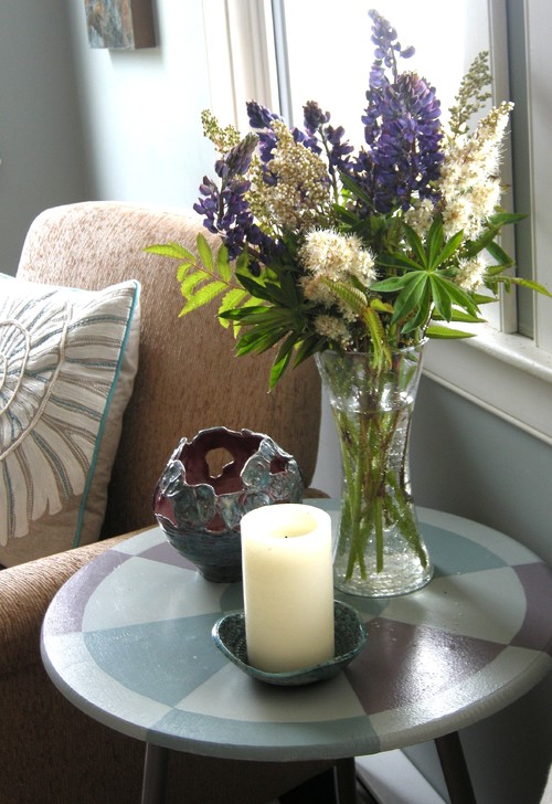
Use pillows for pattern and comfort

Not everyone likes to have a pile of extra pillows around; I get that!  I admit pillows are my weakness and  I have a shelf full so I can make changes through the year.  I think they are a small price for a refreshed  look.   One budget idea for seasonal pillows is to find ones that work well on one side with your every day decor and flip them for seasonal decoration. 

How does this  advice play out in my own home?  


Here's my dining room from last year.  Candles, real twigs and fake berries, white  reindeer, sprayed pinecones, an evergreen and birds. It will all be used somewhere again this year but it won't look the same. 


natural decorations Christmas reindeer berries and twigs candles


For something different this season, I've separated my two buffets and changed the art.


antler candles buffet Mike Gough
artist Mike Gough, The Island 2014

 I've been looking for the perfect place for my new piece of art by local artist Mike Gough.  It seems to be comfortable in the dining room. This painting has a  fall feel that made me think of my moose antler at my summer place.  Let's see if it can be integrated into a more sophisticated environment.  My candles are in place and ....   It needs more than that.  I'm thinking a conversation will happen between what's on the buffets and the table.  Stay tuned.


 In 2014 I wrote a post about the popularity of antlers in home design:  I had reservations about their overuse.  Whenever anything becomes too popular I am automatically reticent about employing the trend in my own home or  the homes of clients.  I decided there was a middle ground when it  comes to using antlers in an interesting way  as described in my initial post.


My antler gift finally moved indoors this summer once I decided it was suitably bleached.  The other one  was left in the flower bed.   Once moved inside it took up a  nomadic existence as you can see from the photos below.  You never knew where it would turn up.

 trunk, beach house, antlers  and candles

On the trunk in the living room for an evening of company when you want some ambiance.  The antler served as a place holder for the remote start candles.  I love this invention;  they flicker like real candles, smell like real candles and you don't have to worry about fire.  Thanks Costco!


antler and candles, beach house, handmade dining table


Or on the dining table if you want to use the the trunk for food or drinks.

or

as part of a console table vignette.

console vignette, antler, beach house, Home and Cabin

Our summer place was featured  in a local design magazine called Home and Cabin.  I needed an organic shape to add dimension to  a  vignette I created for the shoot.  My antler was perfect in scale and form.  It almost looks like writing and relates well to the other collected items on the tabletop. 


glass container with rope, antler, bleached wood floor

And when not in use, it resides on the floor in the corner  ready and willing to leap into service when called upon. 

I saw this  Fall application today on Pinterest and it gave me a new idea for Christmas.  Guess I'll be dragging antlers to my city home next month! This works so well because everything is bleached even the table top.  Did I mention I love bleached wood

antlers centrepiece, white hydrangeas, white pumpkins, bleached wood

Perhaps you have an antler in your life and have ideas for  its use.  I would love to hear from you. 


Do you like a little nature inside your home?

Do you love to find something that looks good and costs little or nothing?

Do you like quick  pops of texture and colour ?


ferns, sea urchins, pottery, beach decor, summer house
Barnacle vessel by Anita Singh


Then think ferns.  Wild ones, the ones you see growing in the woods or other damp places.  They are  a constant in my summer decor mostly because I don't have ready access to cultivated options and also because I love to create interest and a homey, nature inspired look without spending money.


Living on the edge of the ocean, in a meadow with thick woods behind me is the perfect spot for foraging for bargain accents.   I often combine sea related objects, some found and others hand crafted.


ferns, sea urchins, pottery, beach decor, summer house


Another trick I use is to continually move around objects I have to create new looks.  My summer place is small and there isn't a lot of storage for "accessories".  The candle replaced the sculptured vessel in the photo  above.   
.   

ferns, sea urchins, pottery, beach decor, summer house

 Then an old oil lamp replaced the candle.  So three objects different heights, different textures and different shapes is a simple formula for display.  Another trick is to mimic the shape of the table in one or more of the objects.  The circle is repeated a number of times in this vignette.


ferns, sea urchins, pottery, beach decor, summer house


As the ferns started to wilt,  I removed them and cut some grasses and alder leaves to flesh out the display and moved it to another spot.  Leading the viewer's eye is another great trick to use for simple displays.  Your eye pops from the rope ball, to the bouy and then through to the ferns and lamp.  Again I have different textures, heights and shapes.  The added texture of the lamp base and the table creates a very inviting vignette.  

If you don't have a meadow or woods near you buying several ferns at the florist has the same effect.

Do you have a favourite go to wild plant to use in your  arrangements?


 I have a love hate relationship with louvered doors.   I like the free flow of air into closets,  but I dislike all the vertical lines and fussiness.   Many houses built in the eighties sport this type of door.  We have removed some of ours and replaced them with a contemporary looking slab door more in keeping with the streamlined look I like, and we decided to update others.  


And here's the last remaining set we have just waiting for a facelift.....

How to update louvered doors

Designing Home: Updated louvered doors 


All you need is 1/8 inch MDF or plywood  (some doors may have enough room for 1/4 in. ) and construction adhesive, (PL Premium is my favourite). 

 Lay the doors on a table or bench and measure the size of each panel area.  Cut the wood  to cover each  louvered panel section,  add a dot of adhesive every third slat next to the border and press the wood panel in place.  It should fit snugly, if not you can always caulk any seams before painting.

Use clamps or add something heavy to hold each panel in place and let it dry overnight.  Add new handles of your choice.

Reusing louvered doors for new projects 


When you remove the doors in favour of new ones you are left with two perfectly good doors that need a new life.  

Designing Home: Louvered bathroom cabinet


Here's the cabinet my husband made for our summer house  from the top half of two closet doors.  It nestles nicely into a small alcove in the main bath and holds things you don't want on display. It also gives you a great surface for changing vignettes.  We decided against hardware because you can easily open by using a louver as a pull.  It also gives it a more contemporary feel. And now what to make from the bottoms???

There are so many creative ideas for louvers on Pinterest.  I admit that many of them have a very country or beach feel to them,  but if you crave a more contemporary look there are ways to achieve it.

These are my top three faves:

Headboard 

source

Painting the louvers  black  the headboard  a very contemporary feel that I quite like.


This treatment is much more country, but could be updated  if they were painted charcoal and the bedding was adjusted accordingly.


Sofa table 


The straight lines of this table make it suitable for any decor. Colour and what you put on it can automatically update the look.


Standing Shelves 


Jessica Monroe

If you wanted this to have a more contemporary feel you could paint shelves and sides the same colour and add plain crown to the top and bottom.

So many creative uses for louvers.  I love to see materials getting a new life!

Have you ever gone into someone's home  and it was so perfect in every way that you were almost afraid to sit down or move?

When everything looks new, co-ordinated and just so, you end up with an unwelcoming and often boring home.   Such spaces can make visitors feel confined and uncomfortable.  Nothing invites you in because when  everything is  perfectly matched objects become a blur.

 Is there a middle road?

What makes an interesting  and inviting space? Do you need a large budget to have a great home?

Fortunately you can have a very interesting space on a modest budget.  It just takes a little ingenuity.  As with most things in home decor what someone finds interesting  or inviting is dependent on their likes and dislikes;  I can only write about what I find interesting in a space.  Here are some of the characteristics I think   create interesting spaces.

It has a collected feel

That simply means that the home has objects that have been acquired over time and in different ways.   It could be objects collected from travels, antiques, personal items,  family heirlooms, original art etc.  The space does not look like you went out to several stores on one day and outfitted the place. It definitely does not look like a model home!


The rooms are arranged for conversation

Nothing is as bad as going to someone's home and not feeling like you are meant to be there.  You can have that feeling for many reasons, but  it often boils down to not feeling part of the conversation or not having a comfortable place to sit or lay down a beverage.


I would love to spend an evening here chatting with friends.


There's a mix of old and new

Pristine is not that interesting.  Often when everything is new you don't appreciate any of it.  You need a yardstick against which you can appreciate the newness, and that means having some things that are older.  Another great thing about  old pieces is the sense of history and intrigue they create.  Visitors are left wondering why the pieces are so important that you've decided to keep them.  If you like very contemporary or modern decor, there is still a place to add interesting objects with a history.

Briggs and Solomon 

There's a mix of hand crafted and manufactured products 

In our world of mass production, it is so easy to forget the importance of the marks left by the hands of an artist and the presence of ideas in objects.  Having  art, fine craft and the hand made is like having a whole pile of interesting people over at one time.  There is a merging of ideas and various takes on the natural and man made world. Then there's the one of a kind aspect.

Designing Home/Margaret Ryall

Everything in this space is hand made by various artists.   Even the plant was grown locally.


The natural world is referenced  

Designing Home/Margaret Ryall


This unique vessel titled Barnacle by Anita Singh plays nicely with the glass bowl of sea urchins and wild ferns.  The nautilus design on the pillow supports the overall outdoorsy theme in this casual summer house.  The table in the photo above can be seen in the background. 


 Accessories are moved/changed 


Designing Home/Margaret Ryall


Another week and a different  wild flower arrangement  and vessel by Anita Singh on the little  hand painted table.  The objects and flowers add colour, texture and variety in forms to the vignette.  A painting by a local artist peeks out behind the chair, something new to be discovered.  Candles are always inviting. 


Thought has been given to space planning 


The room is arranged as well as it can be given the space available.  The layout is conducive to flow through the space.  There is an obvious visual flow as well as  defined traffic lanes.  There's variety in heights of objects and  textures. Even a monochromatic colour scheme needs contrast.


There are surprises to be discovered

I love a bit of the unexpected.   There are all kinds of ways to achieve this.  It could be a colour that you might not think about pairing with your colour scheme.  It could be an a family heirloom, some of your child's artwork scanned and made into a book, a vase you made in high school art, the work of a friend,  a display of framed post cards from trips you've taken arranged in a grid, a piece of furniture in a place where you wouldn't expect to see it, etc.  The sky is the limit.


How pleasant these doilies look backed with blue and enclosed with white frames .  Such a great way to display family heirlooms.


 I am intrigued by the chain hanging from the candlestick.  Does it have significance to the homeowner? Did a visitor drop it and it's placed here to keep it safe?  Did the homeowner change her mind just before going out?


 Each piece has its own compartment that acts like a mini frame.  Together there is coherency in the pieces and it is very pleasing to the eye.  My favourite is the white doll.  Where did that come from?


And why not end with glowing forsythia, bold in scale and vivid in colour? The arrangement look so great in front of a simple, repetitive composition of fish. 

What tricks do you use to create an inviting home?

So you have an armoire and you are eying that space between the top of it and the ceiling.  Do you or don't you put anything on top of it?   You might want to consider the following:

How much space do you have to work with?
If you have less than 24 inches  I suggest forgetting about adding something above it. Here's why:

armoire

This is a lovely  armoire, but the flowers are squished in, and they would be so much 
prettier in a different spot. The arrangement looks awkward.  The scale of the flowers and pan are perfect if only the armoire were a little shorter. If you choose to put something smaller in scale on top it would be difficult to see and you would have to stand back quite a bit to see it. 

BUT sometimes you can make it work.  There's always an exception to every  rule.

armoire

Even though these baskets touch the ceiling in places, their colour, scale and random/exciting arrangement  make them appear as if they are an extension of the armoire. The armoire is also at the end of a hall and will always be viewed from a distance allowing  you to see what's on top of it.


armoire
source

And you can usually get away with one large low object with a tall armoire

especially when the object is the same colour as the armoire. 


Do you want your eye to go to the top of the armoire?
If your armoire is a centre of interest in your space you may want to add other elements to enhance that position and make it even more commanding.   You might also want to add something if you have other tall elements in the space or you want to create some height variations among the various verticals in the space.

If you have enough space and you want to draw attention to the armoire here are some tips to consider:

Think in odd numbers. 

armoire


If the armoire has glass doors, consider using the same type of objects stored within it on the top.

armoire

This arrangement of bottles and bedding is a natural addition to what is already stored inside the armoire.  The light colours make the whole unit look very cohesive.


armoire

  In this child's room the top of the armoire seems to be the perfect place to store these large toys.  Because they are the same colour as the room and the armoire, they don't seem too big.  That leads me to the next tip:


If you don't want to draw too much attention to the objects, but you want to fill in the space consider using objects that are the same or similar colour of the armoire or the wall or use clear glass. 


armoire


armoire


armoire


If you are going to add a piece of art that high make sure it is a bold image that it can be read from a distance and lean it against the wall , if you are considering using a photograph the same guidelines apply.
armoire


armoire


Think about groupings of the same object in different sizes. e.g., vases, glass bottles, boxes, baskets, birdcages, wire sculptures, spheres,  ginger jars, etc.
If you scroll back through the photos in this post you will see this tip used in a number of ways.

How about you?  Do you have any thoughts on decorating the top of an armoire? 


 Are you challenged when it comes to arranging  accessories? Do you look at details in  decorating magazines and marvel at how everything  looks just right? Many people think the final touches are the most difficult part of home decor, but they don't have to be.  There are all kinds of tips and tricks of the trade. 

One of the simplest design tips I can offer is the use  of  letter formations to organize interesting accessory vignettes. I'm calling on my background in visual art and floral arrangement to offer you this advice.  Other decorators may have different ways of describing their approach. 

The most useful letters for designing vignettes are ....  A, V,  O, C, L, and M.  

Here goes...

A


eclectic bedroom traditional bedroom bedroom vignette


This is a very tight A line of design.  The visual height is always through the middle and the base is wider, but the bottom width can vary.  My eye wants to see something slightly taller than the dish - a sphere  would be lovely here. Perhaps the owner is like me,  always looking for just the right object to finish a room.


vignette, black and white, A line of design

source

Another A with a tall vertical.  Because this is a monochromatic scheme the overall A shape is more evident.  Are you noticing how the height is usually a piece of art?  It  could also be a sculpture, a mirror,  a  tall vase of twigs or flowers or photos hung on the wall.  The base can also  be much wider and the height much less than these examples. 


console table, vignette, V line of design
 
The reverse of A is V. In a V the lowest point is usually in the middle of the arrangement.  Sometimes thinking about it as a check mark is helpful because one side is usually taller and one is shorter.  A V line of design doesn't  have the height through the middle that an A line of design does. Sometimes only these two shapes are presented in vignette discussions, but there are so many more ways to think about it.  


C


Quintessential Dressing Table eclectic bedroom
 Lucid Interior Design Inc.

vignette, console table, C line of design


source 

 You don't often find C lines of design and they are the most obvious when there's only one object banked by something that is circular as with the mirror and twigs.  Your eye just wants to make that sweep.  But sometimes it is the placement of objects that creates a C sweep with the largest object placed at the beginning of the C as in the photo above. 


 o
Joni Spear Interior Design contemporary dining room, vignette
 Joni Spear Interior Design

 Some designers may argue this is a classic V formation but I would disagree because the mirror causes the eye to move in a circular fashion around the display.  The lamps are taken in with that sweep.

 Wakefield Residence modern living room, vignette, console table
 Rachel Reider Interiors

 Another  symmetrical O line of design.  The base is set so broadly that your eye just wants to do the circular movement around the objects. The three rounded shapes  add to the circular movement.  


vignette, starburst mirror, o line of design

Another very strong O line of design.  It is even more obvious when you have a narrow base. 


Metal decor modern living room, console table vignette
  CNW PRODUCTION

Urrutia Design contemporary , console table
Urrutia Design


The requirement for an L line of design is a very tall object placed on the edge of the design with a broad base.  Of course you can also reverse the L.  If the hurricanes were taller I would call the  vignette above a V. 


M


You don't often see the M line of design used, but it works well when you are displaying collections where you have several heights with dips in the middle and you start with shorter objects on the ends.  


traditional mantle vignette

source 

console table vignette blue lamps


If the shorter objects are on either end it is an M, but when you start with taller objects on the ends and it is also high in the middle  it moves into a W.  


What line of design do these vignettes follow? 

1.


2.


3.


1.This is  an A because of the wide base and the tall height through the middle. 

2.  Whenever you see a  lot of objects of similar heights spread out and starting and ending with a shorter object it is an M.  The more objects there are it can turn into a long zig zag of Ms. 

3.  Oh so tricky.  Without the curved object to the right it would be an O line of design, but your eye stops on it making it  a C. 

 
And there you have it.   Keep your eyes open when you see arrangements and observe the  lines of design  used. Then start arranging! 


Author Name

Contact Form

Name

Email *

Message *

Powered by Blogger.