2013


 I have lots of love affairs and Scandinavian design is one of them. I developed this passion in my teenage years when I discovered a book in our local library.  Just to put you in the loop, it was a new book then.  It  is  hard to believe that one event can impact one's design aesthetic for life, but that's the case because  I've woven various elements of  mid century Scandinavian design into every home I've  had.

Scandianavian furniture design mid-century modern

Here's my take on  the elements of  mid- century modern Scandinavian design and how I've interpreted it in my own home. 

Form

  •  function is the priority, and then  form is pared back to its simplest statement 
  • materials are chosen for their beauty and longevity
  • the lines are clean and  minimal , often with sinuous curves or  very "boxy"
  • craftsmanship is flawless
  • 360 degree design -  looks good from every angle 
  •  prominent use of wood , followed by  plastic and metals
  • emphasis on nature and organic forms; bring natural materials in
Scandinavian furniture design

Scandianavian furniture design
Scandinavian furniture natural tones

Scandinavian furniture design light wood
White furniture on light wood

Check out  other iconic furniture designs in a previous post . So many well known furniture came from Scandinavian designers.


Colour/Light

  • emphasis on magnifying natural light
  • white and off- white interiors with blue or blue gray or black
  • muted  tones,  restricted to neutrals 
  • simple or no window treatments

Scandinavian design colour scheme
Colour in Scandinavian Design

  White colour scheme Scandinavian design
 White colour scheme with light wood


 neutral colour scheme in Scandinavian design
Neutrals with natural wood

Shape

  •  geometric  patterns, free form / organic and florals
 textile patterns Scandinavian design
organic patterns

geometric textile patterns Scandinavian design
 Bold geometric patterns 


Love the hint of blue with the black, white and gray in the  geometric rug.  The pop of blue with the throw is inviting and also creates a sense of warmth in the room. 

geometric white and black patterns Scandinavian-design
geometric patterns

This is such a crisp but inviting room that is made interesting by using a range of textures and patterns.  I love how the striped rug anchors everything.

 accessories by  Lassen Scandinavian design
Lassen Accessories

 Texture

  • wood is highly valued and  used extensively for floors,  walls and furniture
  • natural materials in textiles: linen, wool, cotton, hessian, fur (sheepskin)
  • glass, pottery is used for many accessories
texture in Scandinavian design
Texture in Scandinavian design
 source 

This image shows a simple room with  many natural material in one small space: wool, felted wool, fur , cotton and possibly linen.  And great art to anchor the space,.  Wouldn't you love to sit on that chair?

natural materials and texture Scandinavian  design
Natural materials in textiles


Another chair holding  a selection of cozy textiles that you can choose to cuddle up with. 

accessories texture Scandinavian design
 Texture in accessories

There's nothing like a matte inky black vase and natural elements to draw your attention to a corner or an interesting piece of furniture.  This one is so sleek next to the roughly carved  stool. A great mix. 

texture knits Scandinavian design
Knits in Scandinavian  design

 Nothing is as inviting as knits on a bed.  All that texture, light colour and cuddle potential.

Space 

  • uncluttered,  room to rest the eye
  • easy to move around
 open space Scandinaviandesign
Open design


 And here's my  always in transition, uniquely Newfoundland,  mid century Scandinavian look at Christmas!

Scandinavian colour scheme Newfoundland home
Scandinavian colour scheme

I like minimal window coverings in a south facing window when privacy isn't an issue, hints of black and natural toned birch with lots of white and gray.


Scandinavian design with a twist
Scandinavian design  with a twist

Christmas decorations without the traditional red or green and my new Kubus 4 candle holder  that is quickly becoming my favourite accessory next to  pillows from my sister who knows just what a room needs.    
 mid century modern dining room Scandinavian design
Mid Century Danish modern hand crafted

Scandinavian design Christmas
Natural elements Christmas

Margaret Ryall


 source 

What elements of Scandinavian design do you have in your home? 


  Margaret Ryall

We all have our Christmas rituals and mine usually start December 1st..  I  always make something for my entrance first.   I am not one to overdo things.  I re-use what I have or forage in  my garden or the gardens of friends. Then I added some LED lighted twigs and silver balls and a hit of mesh ribbon.   The purple connects with my front door. The blown leaves remind me that we are between seasons.


Margaret Ryall

 Each year I allow myself one  or two new purchases and send at least one small bag of assorted objects to a local charity shop.   I'm extravagant this year with two purchases.  I've been looking for a plain wreath to change around each year and found this great one with LED lights  for 25% off at Canadian Tire.  This year the theme is snow flakes and silver... just because.

 
 Margaret Ryall

 This year I embraced our new Target ( very near my home) and purchased three  dark silver vases that you will be seeing around my house through out the coming seasons.  I love repetition in threes as you can see.   A little sparkle with red is refreshing.


   Margaret Ryall

I have a fondness for trays to corral objects into a composition.  This lovely white one was a gift from my husband last year. It has silver leaf leaves and birds on it (see below). 

Candles are always a must at Christmas time and I usually arrange those I have on a tray, add in some flowers and ornaments and call it a day.  I am still fiddling with this arrangement and I may need to invest in some new candles  because these are looking a little worn.  There's nothing like a photo to help you refine a composition.   The finials are going and I must put in one more pillar for a chubby candle.     Love plain white mini carnations because they last forever.


 The new  version with finials removed. Looking better.  Every time I pass by I move something!

That's it until December 14 when I usually add the second layer of decoration and put up the tree.

I hope you are putting a little sparkle in your home. 

The four corners of a room are often a no man's land when it comes to design.  I am not saying that you have to fill up every corner with something, but I am advocating thinking about your space to determine if  it might need to look more "fulfilled". Here are some of my favourite solutions:

Art 


8 Ways to fill empty corners
Using Art to fill an empty corner
Margaret Ryall

 Usually you can't walk right up to art you place in a corner,  so choose something that can be read from a distance. This lovely matted and framed wood sculpture is stunning for corner purposes.  It brightens up the space, fills it nicely, provides a backdrop for the dark table and lamp base and is a bit of a conversation piece. I was so excited when it was hung on my clients' wall.  


 using art to fill empty corners

This colourful mid century modern space needs art work to match.   It creates another layer for the space that invites the eye to roam and then return to the equally colourful lamp and chair. 


 Round table and two chairs


two chairs round table  in  corner
Houzz

Round tables are great for corners because they allow you to fill the awkward space and at the same time move your eye around so you don't get stuck there visually. The addition of the lamp provides the third height thus creating a more interesting design.

Tall  floral arrangement


round table and ottomans foyer

 When you have the height why not go for it and use something tall to fill the space.  Again a round table is the mainstay for  this foyer area. 

 Built in bookcase 


corner bookcase workspace
Vicente Burin Architects

This beautiful set of bookcases  tucks effortlessly into a corner.  The colour adds to the whole space and the minimal arrangement of objects and books ensures it isn't too busy. 

Chair and floor lamp 

 
vignette chair ottoman lamp corner
 Cravotta Interiors

A round floor lamp behind a chair is a perfect and quite functional solution for a corner. 


chair ottoman floor lamp in corner
 Houzz


In larger spaces the addition of a round table helps to fill the corner and provide variety in heights. 

 A  workspace 


desk chair art in small space
Siemasko + Verbridge

Tidy and interesting  art too.


built in office desk under stairs
  Leslie Goodwin Photography

Or perhaps a larger space to make use of a corner under a stairs.  


 built in  workspace desk in corner
SchappacherWhite Architecture D.P.C.

Large scale vases/urns


large urns in dining room
InHouse Design Studio

Sometimes you need a certain something to complete a design and these two large scale floor vases do just that.  Imagine the space without them.  


large vase with greenery and sticks kitchen

 This arrangement is not in a corner, but it very well could be.  Rather than bamboo you could use birch sticks if you wanted a more rustic look.

 Corner mirror and two chairs


corner with two chairs table and mirror

Love this solution because it expands the space making it seem like it goes on forever. The glitz and sparkle doesn't hurt either . 

Then there's tall plants, built in benches, screens .... The list is as long as your imagination.  Do you have any bright ideas for filling corners?

 Decorators get all kinds of requests for services from furniture layout to full home designs. I like the variety of smaller jobs with  the ones that go on forever.  Two of my favourite tasks are rehanging art to best advantage and providing the last layer of accessories in a home. Sometimes I get to do both in the same house!

Over the next several posts I want to provide a glimpse into the thought processes I use when accessorizing a client's space.   Think about it as adding the icing to an already great cake. If you do it for your own home or as a professional service, the task is really the same. You have to juggle design principles with individual taste (both decorator& clients) and existing elements in the home.

 Sometimes homeowners have  objects  to incorporate in the design and other times you may  start with a clean slate.   As a decorator, I find  a  clean slate  more difficult  because I want to choose accessories that are "sensible" for the homeowner.  By that I mean  I want to select objects that relate to  family composition, budget, existing objects  and  interests.   Here's a little of how it goes.....

Use what is important to you

Re-use objects from other rooms

Mix shapes and scale

accessories: Making it all work

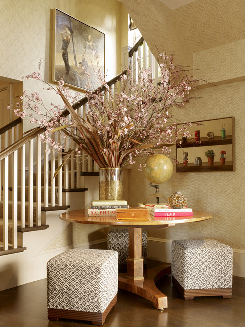
 This is a perfect example of  how existing objects  can  form the backbone of a great vignette.  The crystal vase was a wedding gift and  the lamp was in another room, but the scale was too small for that space. The homeowners had the mirror from their previous home.  When I saw the silver cut edged design in the frame that  mimicked the cuts in the crystal, I knew it would work.  I have to admit I am a firm believer in giving  new life to "previously loved" things.

There is  variety  in the  shapes in this vignette.  The major objects (table and mirror) are rectangles,  the bottle, vase and lamp are cylinders, the ceramic bowl a softened square.   Spheres are introduced in the top of the bottle and the floral shapes.  The leaves serve to soften all the shapes with their lovely droop.

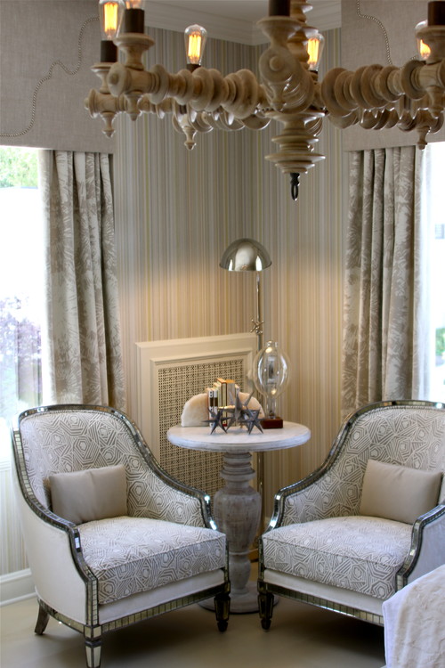
 Have a mix of warm and cool tones


The homeowner wanted something to put keys in so the soft white ceramic bowl with a  coppery/bronze interior was chosen.  If everything is silver why add  warm tones ?  I like to mix metals for interest.  The jar behind  the bowl is mercury glass and it has a bronzy metal top- both work with the warm tones in the orchids.   So three cool tones and three warm tones.   I always mix warm and cool. 

Choose an accent colour from other objects or art

Move the accent colour around the vignette and the  larger space 

 Pay attention to the geometry in a space


Move  colours around the vignette.  This is a must for success.  When you have a mirror and a small space you can depend on what is on the opposite wall to add to your vignette.   You can see glimpses of  the opposite side of the porch  in the mirror. 

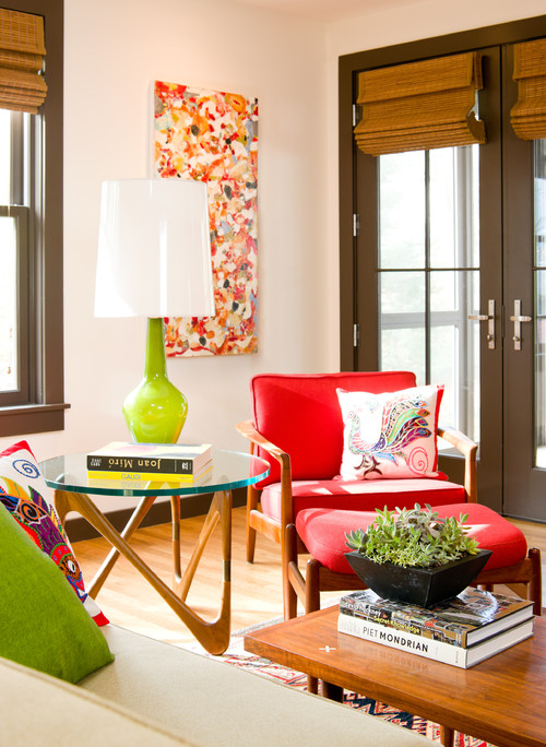
Choosing an accent colour
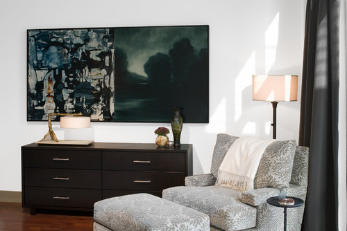
All the walls on the main floor are a cool blue gray.  You already know I like to mix warms and cools in any scheme, so I wanted a warm colour to offset the cools.   The first thing I chose for this room was the art. The pillow was second. The art was chosen based on what I observed hung in the home on my first visit. Two of the pieces had orange as a primary colour and both had elements of  landscape in them.  This is a more interpretative landscape which is also usually  a safe purchase.  The lines of design in the painting  bring the viewer in an up thus adding depth and height to this small space. it works well with the scale of the bench and the the nine foot ceiling.

I couldn't pass up the repetition of the back shape of the bench in the pillow.  It serves to break up the dark in this small space and moves your eye around.  I also love how the diamonds duplicate the linear quality of the trees but in a more complicated way.

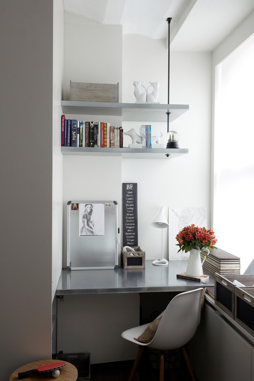
 Choose items that can work in several formations


 If you choose your objects wisely you can move them around and add seasonal items to the decor when needed. And most importantly of all do not get over stressed when things mysteriously get bumped or shoved off centre as the table in the above shot!  People live there.   


And that is why homeowners call a decorator!

Hopefully you are into blue!  Blue seems to be a dominant colour in Pantone's colour forceasting for  both spring 2013 and upcoming 2014. Here's how it's playing out....

 Monaco Blue (Spring 2013)

 Dazzling Blue (Spring 2014)

Two blues, but with great differences.  I can't say blue is a big favourite of mine, but I am really into Monaco blue because it is a warmer blue that is approaching navy. I don't think it is a blue that you would  catagorize as trendy. Perhaps timeless would be a better descriptor.   Dazzling Blue seems to be a colour that will not be  around for the long haul.  It is cold, quite exciting ,and lends itself well to accessorizing.   It isn't exactly a colour you snooze to.  Could you have it on a wall?  Not me, but there are those who would.  

You could use it a little or go whole hog and saturate your space with it. 

 Welcome to the world of dazzling blue....


 .... put it on the outside


on furniture or pillows...

 I really like it mixed with various grays and all that texture.  Both serve to tame it down a little.  You will notice quite a bit of colour variation in the blues above. Mixing a more vibrant dazzling blue in with "tamer" blues seems to be a good solution if you aren't into bright. 


on a wall....

 Whenever I see these fresh, intense blues my mind goes to warm countries like Greece.  Since I don't live in one, it could explain why I am having trouble warming up to this selection.


or a poof...

This is a truly dazzling accent piece that could find a home in most decors.


 in glass or flowers...

and tile ...


on chairs ...

 or bowls...


 or a pillow with lots of other fun colours. 


And here it is with Celosia orange another Pantone selection for spring 2014.


These colours  show up on the runway too! 


Which type of blue decorator are you?


Author Name

Contact Form

Name

Email *

Message *

Powered by Blogger.